 Slider / Webinars
Video, summary, and presentations.
The Webinar took place on May 14, 2020.
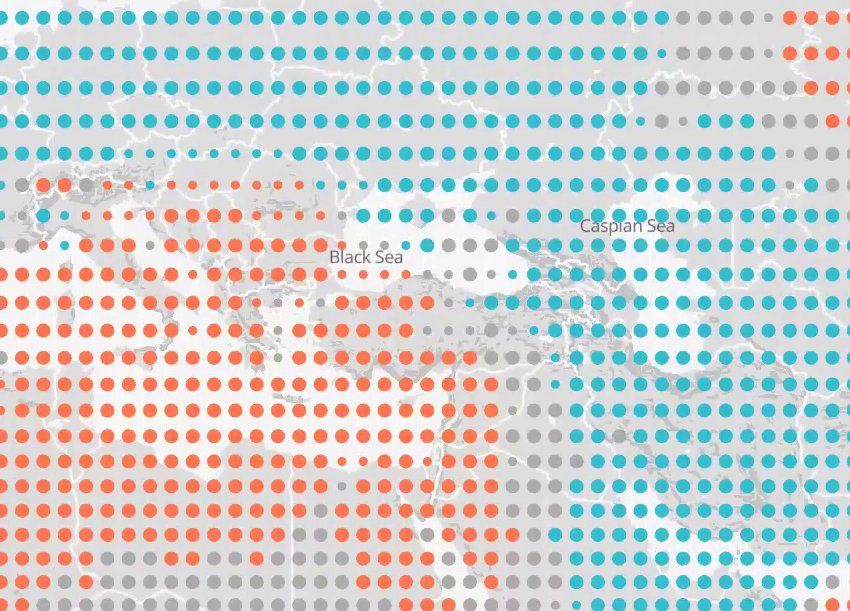
Climate change and its potential impact are difficult to communicate: it seems far away in time and space and the influence a single person has seems nihil. Besides, alarmistic messages tend to paralyze instead of resulting in actions. So how could we improve a safe landing of the climate change message to policymakers and decision makers, so they can base their decisions on the right information? Making use of visualizations can be highly effective. However, a wrong use of visualization, such as using again and again a starving polar bear, can be counterproductive. In this webinar 2 experts will show examples on the use of visualization in short presentations (each 15 min.) and we will discuss do’s and don’ts in visualization of climate information, good examples of visualization, etc.
Speakers:
- Bernadet Overbeek, advisor weather and climate of the Royal Netherlands Meteorological Institute (KNMI) – download the presentation (pdf)
- Isadora Jimenez, communication specialist at the Barcelona Supercomputing Center – download the presentation (pdf)
Watch full video